WordPress Block Editor

WordPress Block Editor: a reader asks…
I have a WordPress-powered website and am having trouble with some page layouts. I have content split into table columns using html coding, but there are some odd text breaks where the text doesn’t continue to the right end, but wraps badly. Any advice for me?
First off, you’re having trouble because WordPress doesn’t do a great job of handling manual html coding within a page. WordPress is intended for website development without having to use html coding (mostly), and html coding in a WordPress page can have unintended and undesired results.
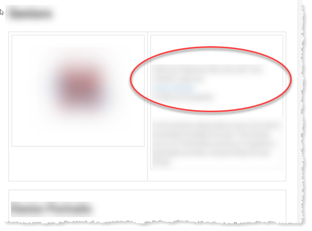
I see that you’re using the “Classic Editor” on the page screenshot you sent. That’s the legacy page editing tool (aka TinyMCE) that WordPress used prior to version 5. Most likely you originally created the page before the Block Editor was available. In WordPress Version 5 we saw the introduction of the “Gutenberg” Block Editor. The Block Editor treats every part of your content as a separate block with its own formatting and placement.
Unfortunately, the initial release of Block Editor had numerous problems and there was a lot of push-back from website developers who then chose to stick with the Classic Editor. Good news, Block Editor is working much better now and by all means you should switch to it. There’s no reason for you to have to use html coding to create tables in WordPress, as the Block Editor has so many ways to manage the layout of your page without having to code. Plus, there are many plugins out there that extend the ability of the Block Editor.
For example of built-in blocks: Columns. Here’s what that looks like. This is the left column. This is a simple block set that allows you to create two same-width columns on a page’s content area.
This is the right column. On a wide screen, you’ll see two side-by-side columns. On a small screen this will be directly underneath the left column (e.g., the column blocks re-flow to fit the screen size).
To choose various blocks in Block Editor, click the plus sign at the top-left of the editor page. One handy block is the Tables block which lets you put a table right into your page without having to use a plugin – handy!
| Table 1 | | | Amount | | | Amount |
| this is the first row of the table data. the table and cell widths auto-adjust to fit what you put in. | | | 123 | | | 456 |
| this is the second row of the table data The table block is still a work in progress 🙂 | | | 123 | | | 456 |
There are also plugins that can help you with getting the layout of your page exactly the way you want. A quick search on WordPress.org will reveal some. Such as Grids which adds a lot of layout functionality to the Block Editor and reduce your dependence on widgets and themes for layout options. This plugin does have a bit of a learning curve to it, so you may want to peruse through their documentation to get some familiarity.
Speaking of familiarity, if you haven’t really put the Block Editor to use yet, it would be helpful to watch a tutorial – here’s one:

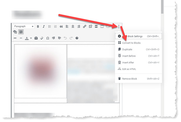
One thing you may want to do is convert your current page using the Classic Editor to one using the new Block Editor. That’s fairly simple. When editing the page, the top of the editor shows your MS Word-like formatting menu. On the right is an elipsis (3 dots) – click that and you’ll see a menu which includes the option to “Convert to Blocks”.
Once you’ve converted a page to Blocks, you’ll want to go over the page and if there’s anything that doesn’t look right, you’ll need to fix it. If you have already coded everything into tables, you might find it faster and easier to simply create a new temporary page in Blocks and copy the text inside the tables (bit by bit) into the new page till you have everything. Using multiple tabs is great for this.
Then when the new temporary page looks good, go back to your original page, delete everything and convert the page to Blocks. Go back to the temporary page and copy everything, and paste it into the original page. You can now delete the temporary page and your original page has all the content it originally had, only in the format that fits the blocks editor.

Lastly, I should mention that more than half of all website visits are now being delivered to smartphone screens. This presents a problem to website designers which is well taken care of by using Blocks, since they re-flow to fit the screen. They do this automatically just like text re-wraps when the margins of your document change. It’s much easier to deal with than the old Classic Editor.
This shift in how we view websites has affected design considerations for website development. I expect this trend to continue to the point where every element in a website will be a block and blocks will automatically resize and re-flow to fit whatever screen is looking at the website without getting all jumbled and confused-looking. A good thing, no?
This website runs on a patronage model. If you find my answers of value, please consider supporting me by sending any dollar amount via:
or by mailing a check/cash to PosiTek.net LLC 1934 Old Gallows Road, Suite 350, Tysons Corner VA 22182. I am not a non-profit, but your support helps me to continue delivering advice and consumer technology support to the public. Thanks!


