No iTunes Sidebar
 No iTunes Sidebar: a reader asks…
Hi Chris, I upgraded to iTunes 12 recently, and notice the display is now very flat and very simple. I don’t see a sidebar with my library items and categories any more. Is there any way I can get them back?
Along with iOS 8 for the iPhone and iPad, and OS X Yosemite for the Mac, Apple has released iTunes 12. It’s more than a flashy red icon though, there are a lot of changes. One change may be unwelcome for long-time iTunes users: the elimination of the sidebar. In iTunes 11 and prior, the left-side sidebar was a handy and quick way to switch from different media (music, movies, apps), and most everybody got used to being able to show or hide the sidebar by using the View menu.
But perhaps the most useful reason for the sidebar was to switch between music playlists and quickly add songs to playlists. iTunes 12 only shows you a flat set of icons at the top for your media library, and a set of 3 dots you must click to view all the media categories. This does bring iTunes more in line with the latest in ‘user experience’ and flat design, but if you’re pining for the old sidebar, don’t worry it’s easy to get back – at least for playlists.
All you have to do is click the Playlists menu item and the sidebar will reappear. This works for several media categories you can choose: music, movies, TV shows, podcasts, books, and iTunes U. But it doesn’t appear in the default views when you first run iTunes on your Mac or PC, and you won’t find it in the View menu. 
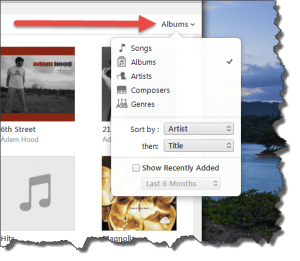
 The playlist won’t work quite the same as you’re used to, but it will do the basic job you want: display the sidebar of your playlists. And if you want to display a different view of your music library (say a list versus album covers, or by artist or genre), that’s all now controlled in a view options menu on the right side of the window. It can be a little confusing because the word which shows on the right side changes depending on what library category you’re using. For example, if you’re looking at your music library it might show ‘Albums’ or ‘Songs’ or ‘Artists’, depending on which view option you chose. For folks used to having a standard control button, this can be disconcerting. For iTunes 12, all that matters is the location of that control, and the only indication that it is a control is that there’s a down caret (arrow without the shaft) to the right of the word. Like many controls in the new, flat design, a lot of the feedback and cues are missing – you are expected to just know that it is a control. That’s great for experimenters, but the truth is that most of us are afraid to experiment these days for fear of messing something up. I’m hoping this flat design fad will fade and more intuitive control features will return.
This website runs on a patronage model. If you find my answers of value, please consider supporting me by sending any dollar amount via:
or by mailing a check/cash to PosiTek.net LLC 1934 Old Gallows Road, Suite 350, Tysons Corner VA 22182. I am not a non-profit, but your support helps me to continue delivering advice and consumer technology support to the public. Thanks!


